Tuesday 17 April 2012

International Women's Day Poster

Hi everyone. I hope everyone having a great day blogging. :) I finished my International Women's day poster. It was a pretty long process though. My first steps were figuring out a concept and I know I wanted to do mother earth. After I got my colour comp and everything I knew I wanted to put a poem in the design for my description, so I got my good friend Zina miller and RK to make an awesome poem. I knew I had to make the layout a little different so I came up with this:


After I got the layout exactly the way I wanted it, I started my painting. It took awhile but I am happy with the end result.

The Poem is (if you can't see it):

She is the universe's dancing soul.

Not only a mother to the people.
She's the daughter to the sun.
An aunt to the waters.
A grandmother to life in the wild.

Mistreated and Forgotten.
Though she's been abused,
She is forever spinning.
Giving food, air, water everyday.

We forget she still needs us.
She needs us to give thanks.
Appreciate and take care, as
In the end- without her-
We are nothing.

Although she can be distractive,
She is beautiful in so many ways.
With so little effort she can
Take your breath away.

Like every women she needs to be noticed.
So... absorb her everyday beauty.
Thank her for all she gives.

A piece of mother earth lies in every woman.
And every women is a mother,
Is shelter, is protector of humanity.
Every woman deserves our praise.

I made this poem the way it is because I believe that women are very sacred, more then anyone even realizes. Every woman is apart of nature. Woman give life and need to be more recognized as a piece of mother earth. It also kind of also has a second meaning because not only do we need to treat women better but we also need to actually take care of our mother earth. I made the colour scheme complimentary so that it really stands out at you and make you want to read the poem. I really enjoyed this and hope you enjoy it as well. :)
Illustation Friday: "shades"

My inspiration for this week was a illustration by Fred Irvin. I really like how its only a couple colours and thats what I'm going to do with my marker illustration. Its quite simple but also bring the veiwer in.

I wanted to do the same type of effect as Fred Irvin's illustration. This weeks word was shades and the first thing I think of when I hear the word shades is those shutter shades that the celeberties where. I think they look pretty neat and wanted to do a cool marker illustation for that. 

I made a sketch of a person with those "shutter shades" on But I wanted to make it kind of abstact looking so I didn't make a face on it.


I made the shades a rich red and made the face part black to make the shades stand out because thats what the word is this week. I made the outside part of the sweater a dark purple to make the shades to stand out. I thought that a bright green would of worked well in the place of the purple but then I thought about it and it kind of would of took the spotlight off of the shades.

heres my book cover design for "shades"


Illistration Friday: "Intention"

This weeks word was intention and my inspiration for this is a cute illustration by Susan Pearl.
I really like the cartoon style and how cute and simple this is. It has a good sense of balance and inspired me to make a cartoon like illustration for this weeks word. 

This weeks word was intention. The first thought to my head when I hear the word "intention" is having the intention of pranking someone. Probably because me, my friends, and my family are always joking around and pranking each other. I wanted to change it up a little and used pencil crayons. I went with a monochromatic colour scheme. I made a kid paling a prank on his older brother. It has the brother getting all wet from the prank with the bucket on the door.


Tuesday 13 March 2012

All while I was in school and through various jobs, I have realized that most success in life is all about "Emotional Labour". There is a podcast by Seth Gordin CBC Podcast Interview that tells all about it. What I learned about Emotional Labour is you have to go beyond and do the things that other people would think is a bother. Things like doing that extra research, making that extra copy, advertising yourself outside of the work place/school, pretty much going the extra mile when you don't really have to.   To have any type of success in life, you must have initiative and drive to put you in front of all of the rest of the competition. It's basically really putting yourself in your work, your "emotionally" putting yourself in your work. You have to really want it to get what you want in life. Taking that little extra mile will pay off in the end, it's just having to do the "labour" is what a lot of people don't like to do.

I have to pick three people or organizations that show the meaning of emotional labour. First person I chose was someone I know from a really good friend, her name is Sandra Hill and she is a photographer/artist. Her Facebook site is Sandra Hill Photography and she specializes in New Born Photography.

She has her own company and always has her stuff on Facebook and even when I talked to her before, you can really tell she is so passionate about art and photography. She has her family involved and started out in her own home. She's actually personally inspired me to really get somewhere with my art.

Another person is one I learned about in class, Von Glitschka. He is an amazing Graphic Designer and I like visiting his site and watching the videos he does. Glitschka Studios site is awesome and makes everything public and always has stuff published on FB. Thats taking the extra steps to promote what you do and that's also another sign for "emotional labour".

My last choice would have to be Leif Peng. I'm totally not trying to be a "brown-noser", I just think its a good example. He has a blog (LeifDrawing101) , flicker for inspirational photo's, always advertising different things on google plus and is always giving the extra help out of class. All this stuff takes so much extra time and this is what emotional labour is.

You have to always start somewhere and it just takes a lot of hard work and dedication to really make it anywhere in life.


Sunday 26 February 2012

It is Week 10 now for anyone who has been following Illustration Friday, this weeks word was fluid. I wanted to do something kind of abstract this week. For my inspiration (I don't know if I can do this) but I used this photo:


This photo is done by yours truly Mazinn Marissa Martin and I called it "Blue Rain". :) I came across this when I was doing a photography assignment and then I took it to photoshop, worked my magic, and made it look awesome! I really like how it looks like upside down rain. The colours are so vibrant and just pop out. I also love how it looks abstract and that's why I chose this photo.

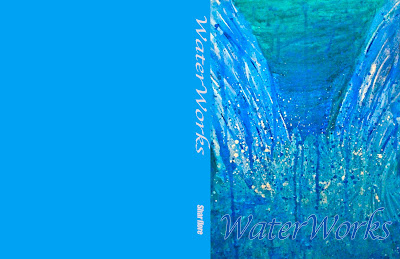
When I think of the word "fluid" I think of the best fluid you could have, which is water. I wanted to sort of a water fall. Since it is abstract I didn't really do thumbnails but I did do a sketch:


After knowing what I kinda want to do, I came up with this process:


Here is my book cove design for my illustration:


Tuesday 21 February 2012

Hello everyone, welcome back to another week with Illustration Friday! :) We are now on Week 7 and this weeks word was popularity. When I think of popularity, I think of the main place "popularity" really counts is in High school. There is always that popular girl that everyone talks about, knows or knows of.


For my inspiration I chose a water colour painting by Michael David Sorensen. If you haven't noticed, I have been really liking water colour for the past couple weeks. I just really love how the colours just blend so well together and it looks awesome! I like how it's realistic with the old school "shaggin'-wagon" and the part of the tree but in the leaves it looks really washed out and kinda abstract.


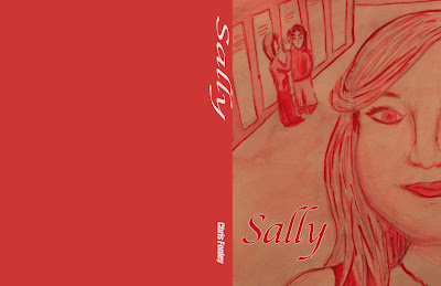
I know I wanted to do a scene of a "popular girl" walking down the hall with people wispering in the background because that's what happens in high school where alot of rumours get spread around. I wanted to also make it a read monocormatic red colour scheme since this week was Valentines week, I wanted to be festive and make it a lovey-dovey red.
Here are my thumbnails:


Here is my process I took after getting the thumbnail I wanted, I came up with this:


Here is my Book cover design:


Sunday 12 February 2012

Another week on Illistration Friday and this weeks word was "suspense".  This is a pretty crazy word to illustrate! I looked up the word and it means : a state or feeling of excited or anxious uncertainly about what may happen. The first scene I thought after reading the  definition was a scene of when you go on a roller coaster and its the first big drop. That is one of the most suspenseful moment I can think of.


For my inspiration was an illustration by Gerald Andrea. This is a very interesting painting cause it's detailed but also leaves out a lot of the background detail. I really like the analogous colour scheme with the green and the blue. Here are my thumbnails:


When I started to paint, at first I was going to make it realistic. Then I was thinking when you are in the moment of almost dropping on the roller coaster, that you have a lot of adrenaline going and everything isn't very clear. I made my painting look really rough and jagged. Here are my steps:


Here is my book cover graphic:


Welcome back to some Mazinn Art! :) 
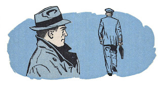
On week 5 for "illustration friday" this weeks word is "forward". When I first heard forward I thought of a forward button, but I cant really illustrate a forward button and theres no meaning behind it, and I personally like to have a meaning behind my art. Then I was online and decided to look at some art for inspiration and some popped out to me, but then I across a painting by Walter Wyles and I really connected with this painting, its exciting and mysterious.
This painting also stands out to me because its water colour and the analogue colour scheme is bring and colourful, vibrant and alive.


This painting looks to me like sails in waters on fire, but at the same time it doesn't, it makes it look like a beautiful but tragic moment, makes you wonder how the painter, Wyles was thinking and feeling at that moment.

For my thumbnails I wanted to draw a man walking forward to something important to him, like his cozy zone.


After connecting with Wyles painting I wanted to do somewhat the same effect as his painting. So for my painting for this week I made a mono colour scheme, I wanted this effect to represent the calm waters. Here was my process:


Here is my book cover graphic:


Saturday 4 February 2012

On Week 4, this weeks word was "Twirl". I was really excited when I found out I had to paint "twirl" when I think of the word twirl, I think of  Shawl Dancers. I always went to the pow wows as a child, it was very beautiful watching the shawl dancers twirl with their beautiful beaded dresses, and colourful ribbons that held their hair. My Inspiration was a painting called "Traditions Promise" by a Native artist named Tom Shropshire. I really like how he made the Mother and Daughter stand out with the beams of light in the background. Tom Shropshire did the complimentary colour scheme very well.


Here are my Thumbnails:


Here are the painting steps I went through :


I made it an analogous colour scheme also I made it so it had a symmetrical balance, I love to make it vibrant with colour! I painted a shawl dancer in the sky so she is close to the Creator when she dances. Here is my book cover:


Thursday 26 January 2012

This week is week 2 and our word for Illustration Friday is "prepare" at first I really didn't know how to illustrate something like that, but after observing things and people around me I came to see that this topic was easy! Preparing a meal!

My inspiration for my drawing is a pen and ink drawing by Daniel Vierge. I really like how rough  looking it looks. I want to make my drawing to look a little rough like how Vierge illustrates it. I also like the view and how he positioned the buildings, kind of a frame within a frame.


My media I chose was graphite pencil, I know I wanted someone preparing a meal. Here are some of my thumbnails:


I chose the first thumbnail because it was one of my best friends cooking and it was easier for me to draw with a actual model in front of me, like I said I was going for a kind of rough look with my drawing. Here are the steps I took to complete my drawing:


Here is my book cover for "prepare", after drawing for the word "prepare" and seeing what I came up with I thought it looked like the perfect old fashioned cook book! pretty proud of myself!


Tuesday 17 January 2012

My 1st Week- Illistration Friday- "Grounded"

I am following this site called Illistration Friday and it's a pretty cool from what I can see so far. Artist from everywhere follow this site each week, and each week there is a word assigned to get inspiration from. This is my first week and this weeks word was "grounded", my inspiration for this project was a peice by René Bouché. I really like how she incorperates colour with white and black imaging. It is a beautiful but very simple artwork, it's also very well balanced. I want to put drawing and colour in my artwork like she does in this peice.

At first I really didn't know what to draw for the word "grounded", then I thought about it, when someone is grounded,  you are basically stuck, not moving, and going nowhere. I know so many people, including my own family, that let their problems and sorrows from their past keep them "grounded". Alot of people around the world let their problems define them. My three thumbnails are of images of a person who is stuck in a state of mind of being "grounded".


I wanted to have a guy sticking out of the ground trying to escape and that part of the my artwork I wanted to be graphite pencil. I want the colour portion of it to be the "problems" or "sorrows" that are all around him, keeping him stuck. These are the steps I took.


I have decided to make a book cover for my graphic: